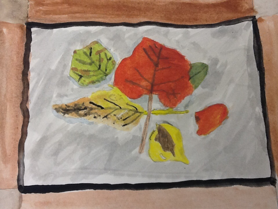
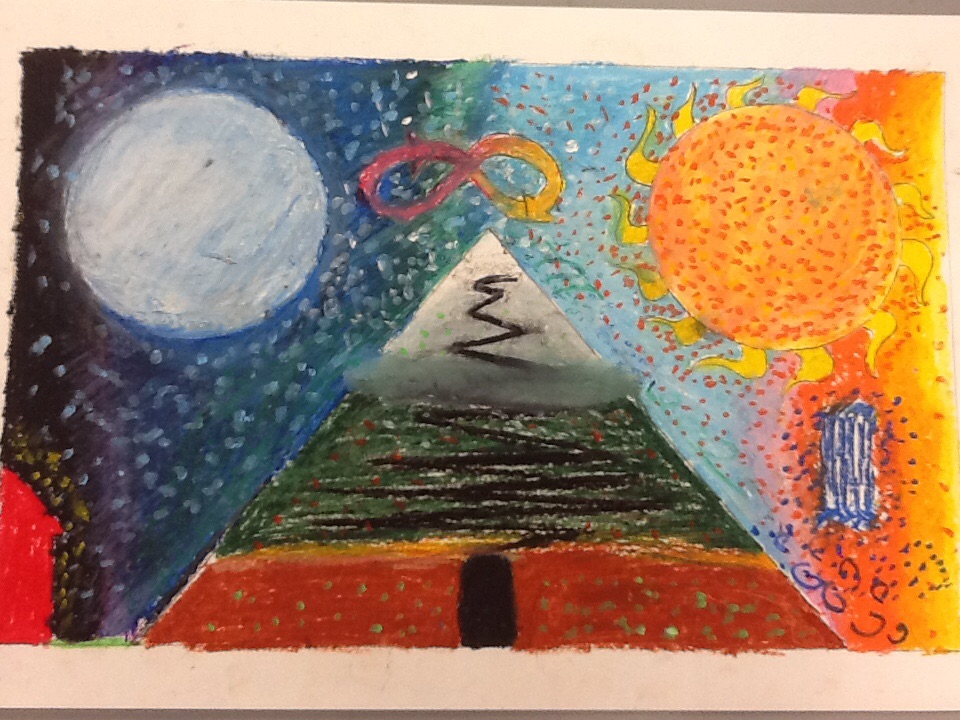
This is my watercolor leaves composition. I thought the creation of this piece was challenging, but still very fun. It was great to finally add color to my art, and I think it adds a nice touch. From this, I learned to layer my colors from lighter colors to darker colors. Next time, I'll use a more precise brush to get fine edges.
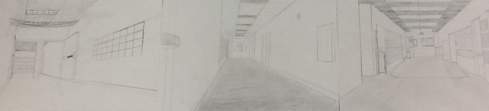 This is the triptych drawing of the hallways that I worked on with Isaac and Kate. Overall, it turned out pretty nice, even if we were missing a corner in the transition between the right drawing and the middle drawing. We can clearly tell which hallways these are by looking at them. We focused on one point perspective in this drawing, and worked on creating different objects in perspective to create different ideas of space and size. This was all done in pencil, and I learned that in order to shade a ceiling or floor, there has to be flow in the same direction on one plane. This was a fun piece.
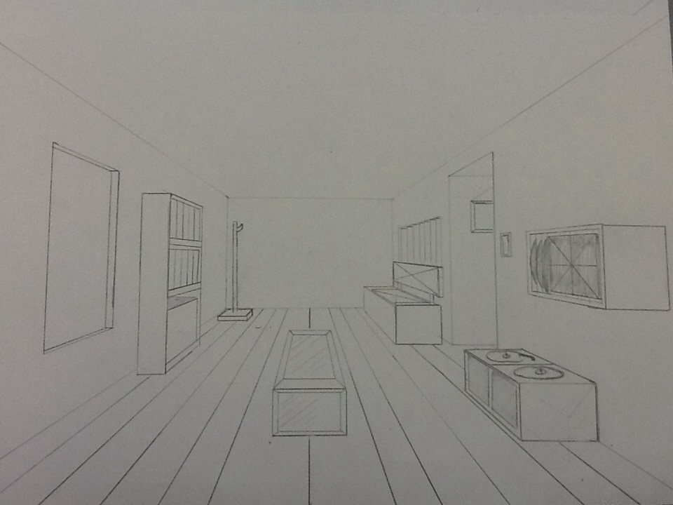
This is my one point perspective room drawing. This drawing looks like a room, but it's as if the room completely surrounds the viewer. The room wraps around the viewer because of the vanishing point on the back wall. Having one vanishing point pulls all the pieces in the room toward it, which give the drawing a sense of perspective. This is all done in pencil, and also, one point perspective was the main idea in this drawing. I learned about squares in perspective through this drawing, and it portrays a "homey" feeling and invites the viewer to stay awhile.
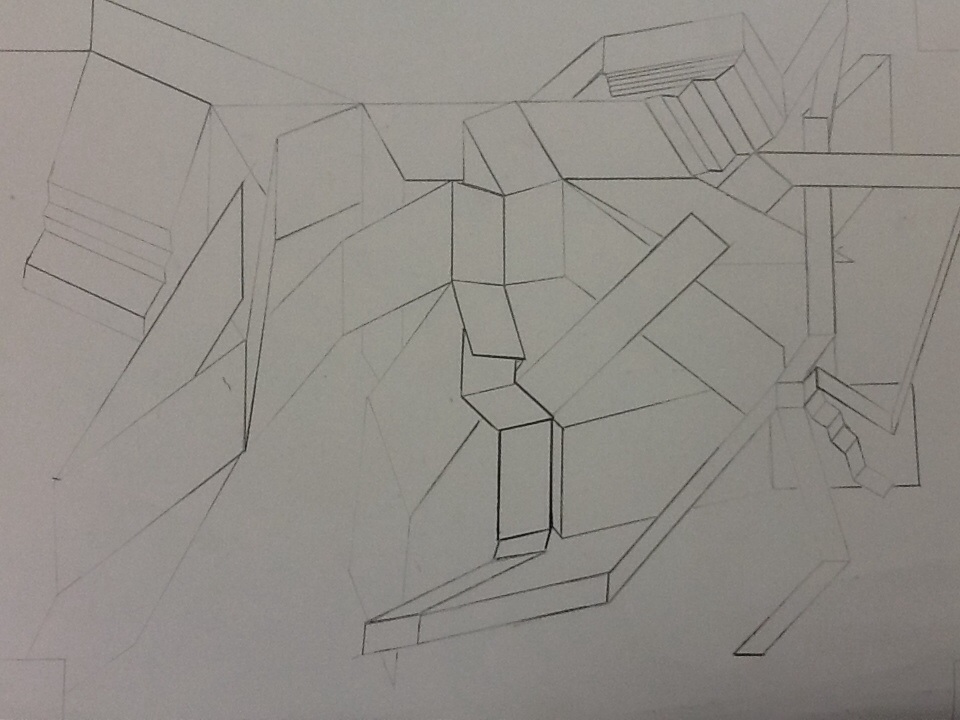
This is my parallelogram drawing. It has a mix of long and short lines, and I used different shades to create the illusion that some lines go in front of or behind others. I used 2-D lines to create space and shapes that appear 3-D. It creates a great mix of shapes to create a world full of stairs and ramps.
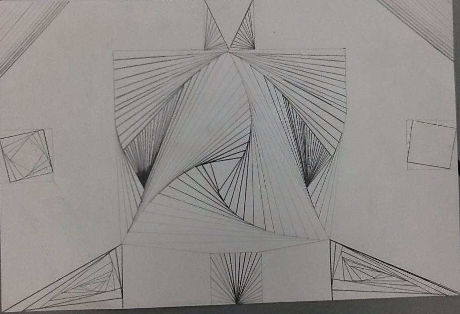 This piece is called "swirling lines". Although all of these lines are straight, the overlapping lines give an illusion of curved lines. This is drawn entirely in pencil. The mix of light lines and dark lines make some lines stick out. I learned that a darker line makes the image seem closer than a lighter line does. The art element I tried to use in this piece was the use of negative space. The negative space and overlapping straight lines work together to fill the page with a swirling image that also pops out to create a somewhat 3D figure.
|
 RSS Feed